| Professional Flowcharting | Home | Samples | Overview | Download Trial | Tutorial | Purchase | Upgrade | Support | Search |
![]() Cause Map: Long Lines at the Ice Cream Shop |
| Description |
For a general introduction to cause mapping, see root-cause-analysis.htm. 
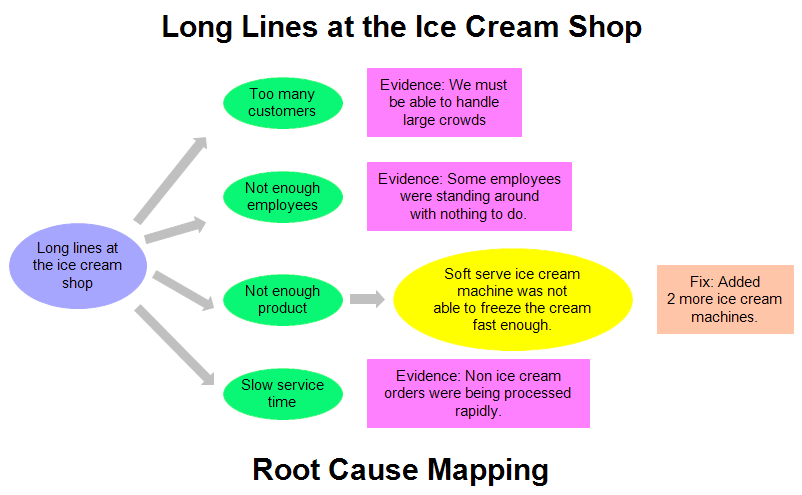
This cause map analyzes why the lines are so long at an ice cream shop. The primary effect is shown on the left in blue. The causes are in green and the evidence is in purple. Yellow is used to show the cause that was the actual problem. Color is not necessary in cause mapping, but it is helpful to highlight the main effect, the causes, and the evidence. You read this chart from left to right and add the words "was caused by" at each line. For example, "Long lines at the ice cream shop" was caused by "Too many customers" and/or "Not enough employees" and/or "Not enough product" and/or "Slow service time." In this cause map, the actual cause was the ice cream machine not being able to freeze the ice cream mix fast enough to keep up with the number of orders. It was solved by adding more machines. |
| Drawing Instructions | If you haven't already done so, first download the
free trial version of RFFlow. It will allow you to open any chart and make
modifications. Once RFFlow is installed, you can open the above chart in RFFlow by clicking on cause-map-ice-cream.flo. From there you can change the text to reflect your problem and duplicate shapes by right-clicking on them. It is often easier to modify an existing chart than to draw it from scratch. To draw this chart without downloading it, run RFFlow, click on the More Shapes button and add the Cause Mapping
Stencil.
|
| Register | Documentation | Privacy and Security | Version Information | Free Additional Shapes | Software Resellers | Free Viewer | Contact |
| RFF Electronics |
| PO Box 1244 |
| Copyright © 1996-2010 RFF Electronics. All rights reserved. |