Fishbone Diagrams
Fishbone diagrams are also called
cause-and-effect diagrams or
Ishikawa
diagrams after their creator, Dr. Kaoru Ishikawa. Fishbone diagrams show
the causes of an event. They are often used in business to determine the cause
of some problem. The item on the far right doesn't have to be a problem and
can be a desired effect.
Free Trial
Drawing a fishbone diagram with RFFlow is very easy. First run RFFlow. If you don't
have it,
download the free trial
version of RFFlow from this Web site.
Basic Flowcharting Stencil
The easiest way to draw a fishbone diagram is to edit an existing one, or
edit a template. These are found at
RFFlow
Fishbone Diagram Samples. Here, we will be drawing a fishbone diagram from
scratch. In RFFlow click the
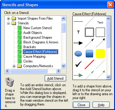
More Shapes 
button. It is on the left above the stencils. The Stencils and Shapes dialog
box will appear. Scroll and click on
Cause-Effect (Fishbone) stencil and
then the
Add Stencil button.
The Problem
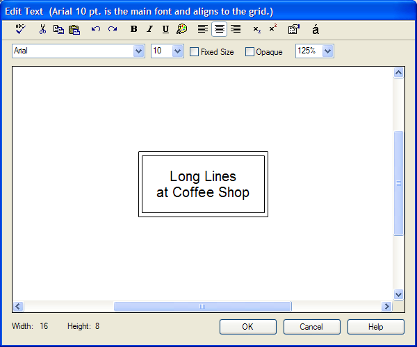
As an example, we will use the simple problem of "Long Lines at
Coffee Shop." This problem is also called the effect. It is placed on the
right side of the chart.
Click on the Effect shape

and type in
the text. Then click the OK button and drag the shape to the right of the
paper. If you zoom out, you can see double gray lines. The outer gray line is
the edge of the paper. You may want to click on
the Orientation button

to choose landscape, as most fishbone diagrams are wider than they are tall.
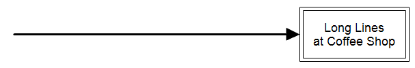
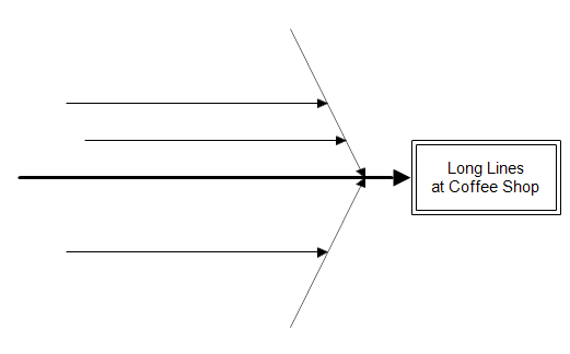
Backbone
Next we draw the backbone of the fishbone chart, which is a large arrow
pointing right toward the problem. Drag the Backbone arrow

from
the stencil on to your chart. You want it to point to the right. To move a
line, drag it at the center of the line. To change the length of a line, click
on it and drag the green handles.
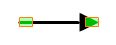
Your
diagram should now look something like this:
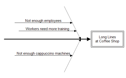
Primary Causes
Next, you think of all possible causes for the problem. This is the most
important part of the process. You must determine all possible causes. Causes
should be measurable and controllable. Consult with everyone who works in the
area and may have ideas as to the possible causes. In our example, possible causes are:
- Not enough employees
- Not enough cappuccino machines
- Workers need more training
These are called primary causes. First you draw some diagonal lines
pointing toward the backbone. You can drag the

diagonal
line shape from the stencil into your chart. Then drag the center of the line
to move it or drag the handles to change it's length. If the green handles
aren't showing on a line, you click on it and the handles will appear.
Normally you would just take a sample chart from our Web site and modify it to
meet your needs. But since this is a tutorial, we are having you draw the
lines yourself. There are several sample fishbone diagrams at
www.rff.com/fishbone-diagram-samples.php.
To add the text to a line, double-click on the line and type in the text. Then
press the ENTER key to move it above the line. After doing this, the chart looks like:
Secondary Causes
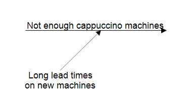
Our fishbone diagram doesn't show any secondary causes. A secondary cause is
drawn with a line connecting to the primary cause. For example, if the
cappuccino machines have been on order, but have not been delivered because of
long lead times, the diagram would show a secondary cause of "Long lead
times on new machines." Some fishbone diagrams place the text on the
lines. You can do this, but it is easier to read if the text remains
horizontal and is placed at the end of the secondary cause line.
You can show tertiary causes and quaternary causes if desired, but this is
usually not necessary.
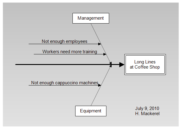
Categories of Causes
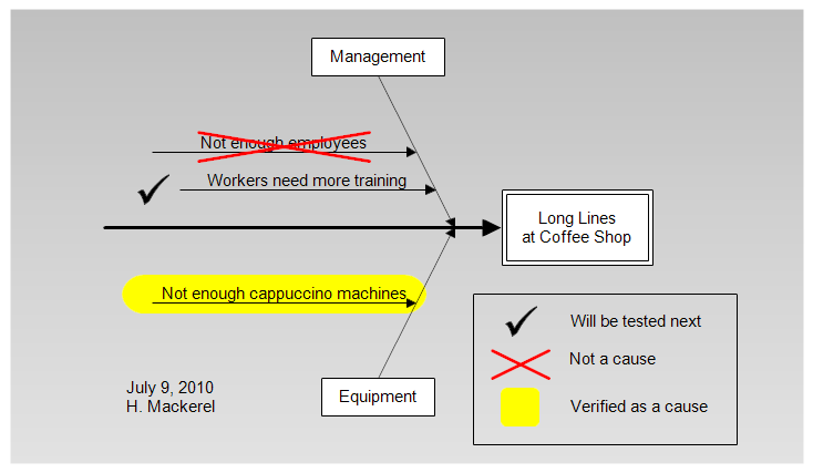
After all the causes are listed, you may want to group them into categories.
You can make up your own groups specific to your problem or you can use the
standard ones. Common categories include: Equipment, Process, People,
Materials, Environment, Management, and Maintenance. In our chart, the two
causes on the top are controlled by management and we place a Management box
at the top. The lower cause is an equipment problem so we place Equipment at
the bottom. We also added a date to the fishbone diagram, the person
responsible for updating the diagram, and a background color from the stencil.
Examine Causes
Once the chart is drawn, you can then examine each cause and mark whether it
is a true cause of the problem. Different approaches are possible. In the
diagram below we added a key to show which causes have been examined. We
highlighted true causes in yellow, put a red cross mark through causes that
were eliminated, and put a check mark near the cause which would be examined
next.
You can download this chart from
fishbone-tutorial.flo.
Finished
You are finished with a fishbone diagram when you have solved the problem.
It then becomes good documentation for others who may run into similar
problems.
Fishbone diagrams are similar to
Cause
Maps. The difference is that the effect is placed on the right in a
fishbone diagram and on the left in a cause map. Cause maps put all the text
inside boxes and not on lines like fishbone diagrams. Also, cause maps don't
use categories to group related causes. Cause maps are a little easier to read
since they never place text on diagonal lines. but the methods are similar and
either can be used to solve your problem. Cause maps show tertiary or
quaternary causes more clearly and are easier to draw.