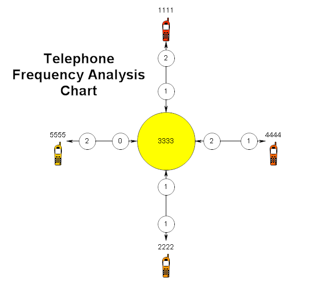
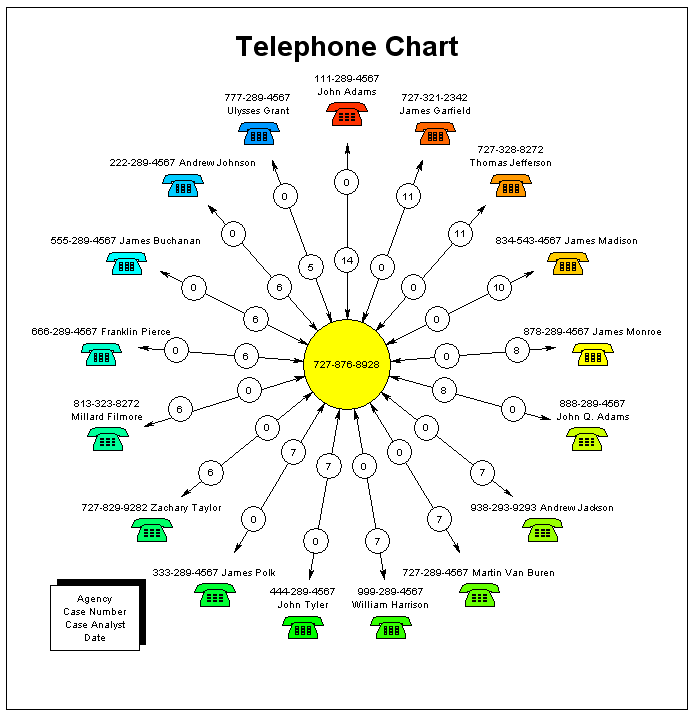
A telephone frequency analysis chart graphically shows what calls
are being made to or from a target phone. The target phone is a circle in the
center of the drawing. The other phones form a ring around the target phone.
RFFlow can take data from a file and automatically generate the chart.
In the chart shown below, the target number is 727-876-8928 and is shown in
the yellow circle. The phone numbers that called the target number or were
called by the target number are listed in the outer circle. In the chart below,
looking at the top phone, John Adams 111-289-4567, called the target number 14
times and the target called John Adams zero times. The total number of calls was
then 14. James Garfield called the target number zero times and was called by the
target number 11 times. The numbers in the small circles give the number of
times a call was made. The direction of the call is given by the arrow that is
closest to the small circle. If you think of the chart as a clock. The phone
number that has made the maximum number of calls is placed at 12:00. The phone
number with the next highest number of calls is placed to the right, nearer
1:00, and so forth. This way you can look at the chart and easily see who is
communicating the most with the target phone number and also see the direction
of the phone calls. The total number of calls is the sum of the numbers in the
two small circles.
1. Get the Data
This example assumes that you have the data in Microsoft Excel. If not, you need
to move your data into Excel, or somehow save the file in a .txt or .csv file.
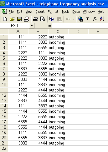
As an example, we will do a really simple chart with 4 digit phone numbers. The
data is shown below as it appears in Excel. In the first row, phone number 1111
called phone number 2222. The two phone numbers are listed and then the
direction which is "outgoing." In row 2, phone number 3333 called 1111
because the direction is listed as incoming. So in Excel, column A is a phone
number, column B is a phone number, and column C tells you the direction of the
call.
2. Save as a .csv file
The data in Excel is saved as a comma separated variable file. In Excel, click
File,
Save As, and set the
Save as type to .CSV (Comma delimited) (*.csv).
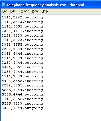
Make a note of where you saved the .csv file. If you open the .csv file in Notepad,
the data will look like this:
3. Use the Proper Format
The data used in generating the chart must be in a text .txt file or a comma
separated .csv file. If you had only a few phone numbers, you could type them
into Notepad and save the .txt file. Normally you have so many phone numbers
that you need to use Excel and do Save As .csv. The .txt and .csv extensions may
not show up on your screen if you are not displaying extensions.
The data in the file consists of a phone number, a comma, another phone
number, a comma, and either the words "incoming" or
"outgoing" all on one line.
For example:
970-663-5767, 970-669-4889, outgoing
970-663-5767, 970-669-4889, incoming
You can format the phone number anyway you want, as long as you are
consistent. If you use (970) 663 576 in one place, then you can't use
970-663-5767 some other place or it will be treated as a new phone number.
If your data comes from AT&T and they specify that column A is the calling number
and column B is the called number, then you should label every item in column C "outgoing" since
column A always calls column B.
4. Draw the Chart
After creating the .csv or .txt file, run RFFlow and click Tools, Auto Charts,
and Telephone Analysis. A dialog box will ask you to select the data file
you want to use. It will show only .txt or .csv files.
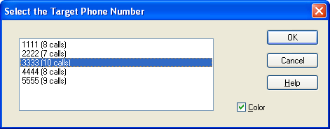
5. Select the Target Phone Number
A dialog box like that shown below will ask you to select the target phone
number. This will become the phone number in the center of the chart. You can
pick any phone number to be the target number. You can also select whether you
want a colored diagram or not.
After clicking the
OK button, the software will process the data and
draw the chart.
6. The Finished Chart
Our simple chart is shown below. The target number is 3333. On the top, 1111
calls 3333 one time. 3333 calls 1111 two times for a total of three calls.
7. Including Names
To include a name with the phone number, simply type the name before or
after the phone number. If you want the name and phone number to be on different
lines, include the characters \n1 between the number and name. There must be a
space after the \n1 for it to work. For example, type all this on one line:
970-669-4889, 970-663-5767\n1 George Washington, outgoing
8. Adding a Title
Since the chart is now in RFFlow, you can add titles and do any editing you
want. The chart can be modified as if you had drawn it shape by shape in RFFlow.
9. Saving Your Chart
You save the telephone chart by clicking on File in the main menu of
RFFlow and Save in the drop-down menu.
10. Finished
At the end of this process, you will have generated three files. One is the
Excel file (.xls) where you saved the data. Then you created a .csv file so that
RFFlow could read the data. Finally you created an RFFlow Chart and saved it in
a .flo file.