
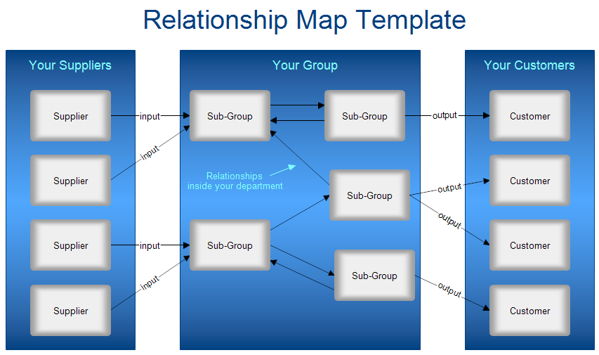
- Your Group. Your group is represented by a rectangle in the middle of the chart. It can be a company, division, section, department, or whatever.
- Suppliers. On the left you draw a rectangle representing your suppliers. Each supplier has a box. Since this is a template, the boxes have the word "supplier," but you will fill in the names of your suppliers. The lines coming from the suppliers show what they supply. The lines in the template show the word "input" and you will replace that word with the actual commodity. If the supplier supplies pencils, then you will replace input with pencils.
- Customers. On the right is a box that shows your customers. You would fill each box with the actual name of a customer. The lines from your group box to the customers show what you supply them. So you will replace the word "output" with the actual output. If your group is internal to a corporation, your customers may be other departments in the corporation. Don't confuse the corporate customers with your customers.
- Sub-Groups. If your group is large, it may have several sub-groups which may have inputs and outputs between the other sub-groups. This is all shown within the central group rectangle. The inputs and outputs may be physical items or documents. If you have a lot of sub-groups, the map will get messy so you may want to draw a relationship map for each subgroup, making it the central group.
A relationship map of a company may be helpful to a new employee to show them what it is the company produces and what are the raw inputs to the company.
What to look for in a Relationship Map.
- Are all inputs and outputs between groups shown?
- What is required for each input or output. Is it a paper document, email, or physical item?
- What are the external interfaces? These are the most important to your company.