For a general introduction to cause mapping, see
root-cause-analysis.php.
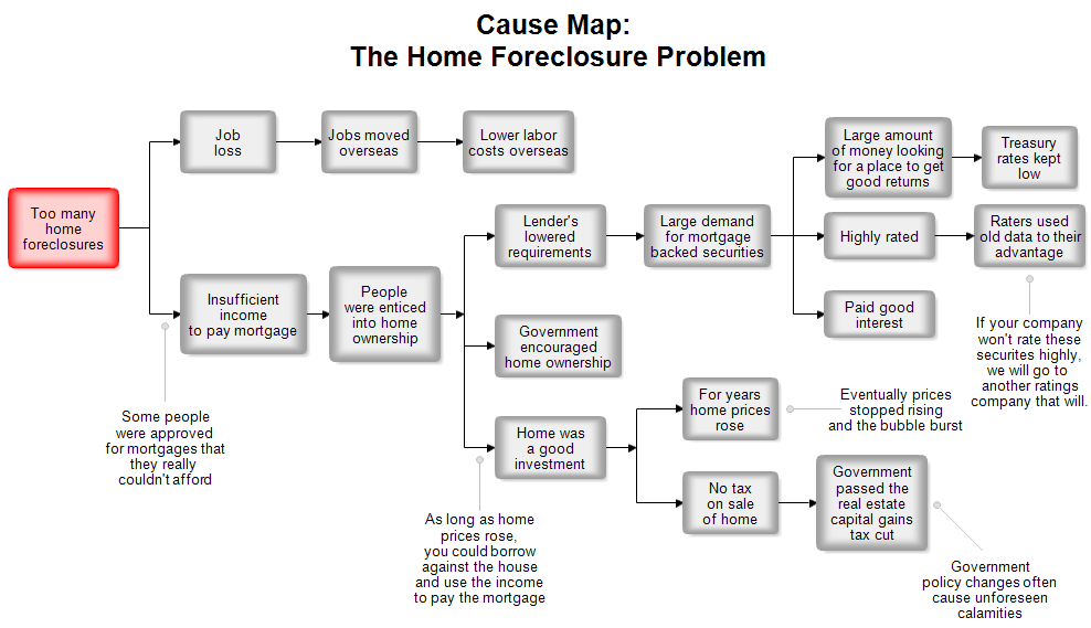
This cause map deals with the home foreclosure problem of 2008 and 2009. The
problem or primary effect is shown on the left in red. Color is not necessary in
cause mapping, but it is helpful to highlight the main problem.
You read this chart from left to right and add the words "was caused
by" at each line. For example, "Too many home foreclosures" was
caused by "Job loss" and "Insufficient income to pay
mortgage."
If you need to add additional notes, you can use a line with a circle and place
text at the end of the line. This is shown above.
There is much debate about what actually caused the home foreclosure problem of
the early 21st century, so this cause map may not be correct. The goal of this
Web page is to show a sample cause map and not to solve the home foreclosure
problem.

Professional Flowcharting Software
|
|
|
|
|
|
|
|